If you’re already using the National Rail iPhone app but are curious about Railboard, this guide is for you! We’ve compared all the main screens, showing how fundamentally similar they are and how switching to Railboard couldn’t be easier.
The National Rail Enquiries data feeds power both apps. So they both show exactly the same information, just with a different look and feel.
The ‘Live trains’ tab
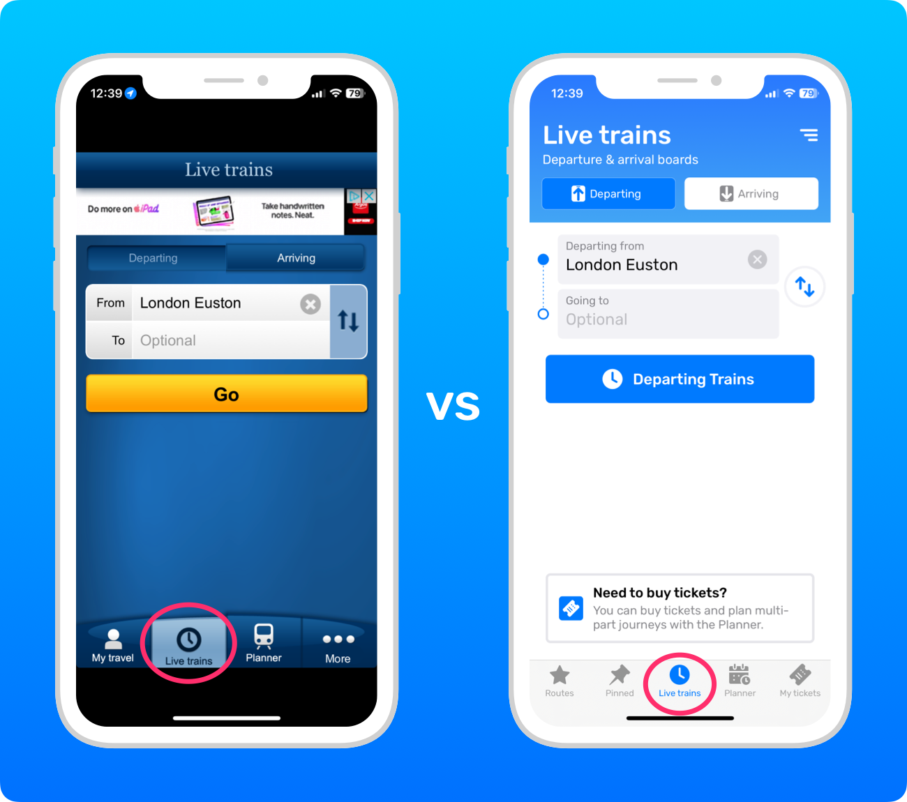
Each app’s ‘Live trains’ tab is equivalent to the departure board screens in a train station. They show direct trains departing or arriving soon.
You’ll notice that the layout for this tab is very similar between the two apps!
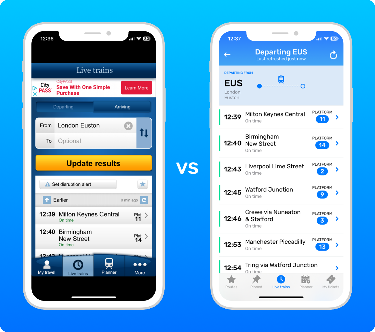
‘Live trains’ results
The results screen is slightly different: the National Rail app shows the results underneath, whereas Railboard presents them on a new screen.
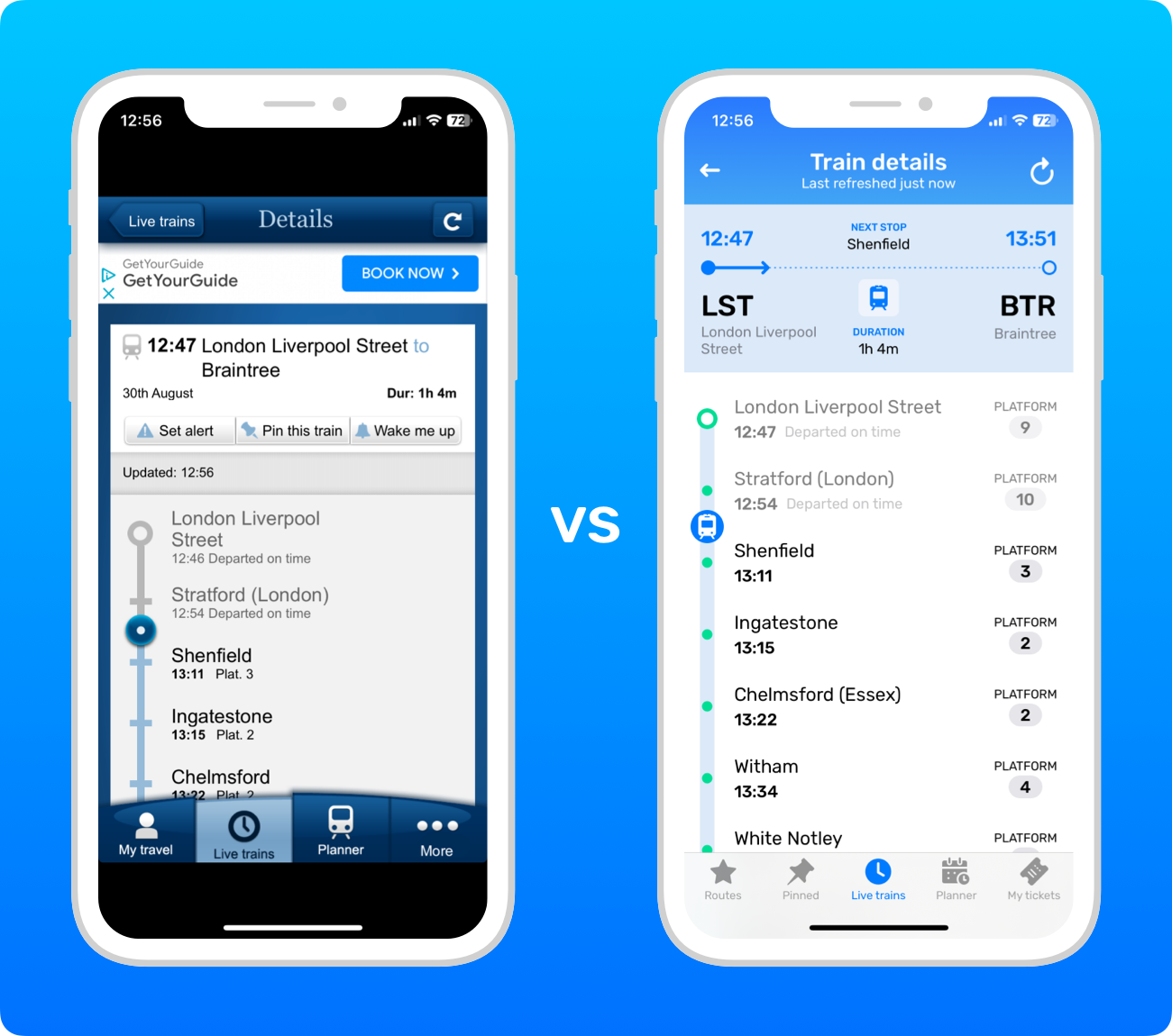
Train details
While the design is different, the basic layout of the train details screen in each app is broadly comparable.
Alert notices
Notices about reasons behind possible disruption are shown in full above the results in the National Rail app, whereas Railboard shows a button to open the message.

The Planner tab
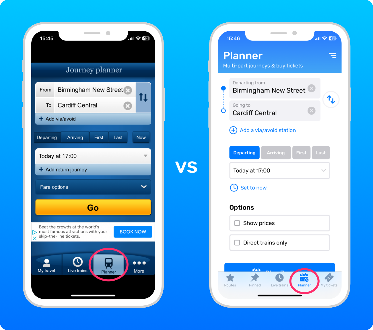
The Planner tab in each app features a full journey planner, which can plan multi-part journeys.
In Railboard, when the ‘Show prices’ checkbox is turned off, it uses the exact same journey planner as the National Rail app. But when the ‘Show prices’ checkbox is turned on, it uses a different journey planner that’s highly optimised for finding the best ticket options to buy.
As a result, the results can be a bit different when the ‘Show prices’ option is turned on or off. Also, because Railboard uses clever algorithms to find you the best Split Tickets and the cheapest routes, the prices you’ll see in Railboard can often be substantially lower than the prices the National Rail app shows.
Planner results
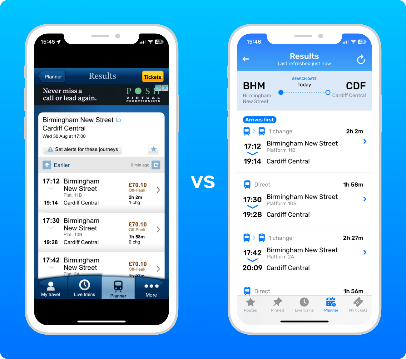
There are only a few differences: Railboard adds an ‘Arrives first’ tag to the journey that arrives first and graphically shows the number of trains in each journey. So you can see which journey is fastest or simplest with a quick scan.
Planner journeys
Like the other screens, the fundamental layout of the Planner journey screen is the same; it just has a different look and feel.

The ‘My travel’ tab vs the Routes tab
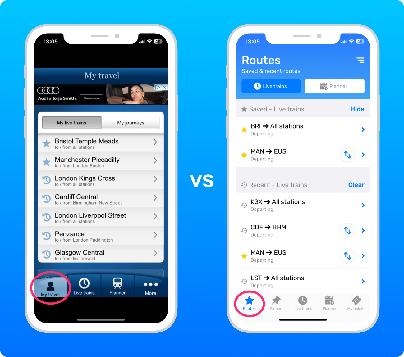
The ‘My travel’ tab in the National Rail app is equivalent to the Routes tab in Railboard. Both allow you quick access to your previous recent searches.
Both apps put your saved searches (or “routes”, as they’re known in Railboard) at the top, as part of the same list in the National Rail app, but in a separate section in Railboard.
By default, Railboard displays station codes instead of their full names, such as “CDF” instead of “Cardiff Central”. You can turn on the full station names in the settings menu.
Recent Planner searches
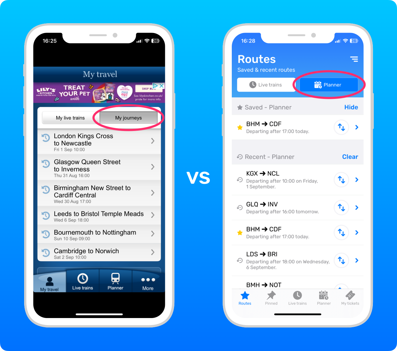
Both apps have buttons at the top for switching between your ‘Live trains’ and Planner searches.
Pinned trains
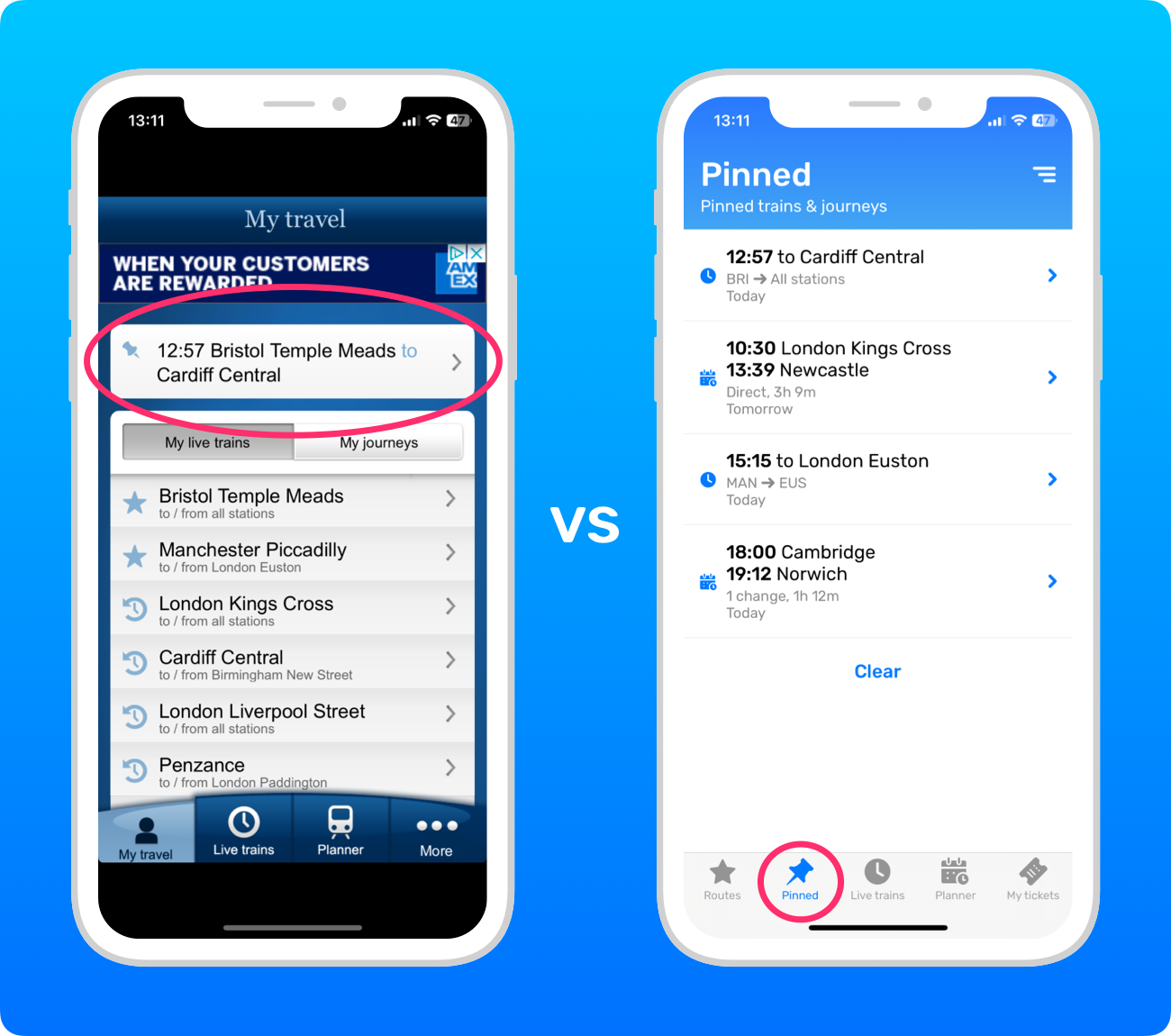
In the National Rail app, you can pin one train from the ‘Live trains’ tab. In Railboard, you can pin multiple trains and journeys from both the ‘Live trains’ and Planner tabs.
Your pinned train in the National Rail app appears at the top of the ‘My travel’ tab, whereas Railboard has a separate Pinned tab. You can reorder your pins in Railboard by pressing and holding them, then dragging them to where you want in the list.
Choosing a station
Both apps have the same four ways to choose a station, which you can toggle between using the buttons at the top.
The first is to search for a station by its name or station code.

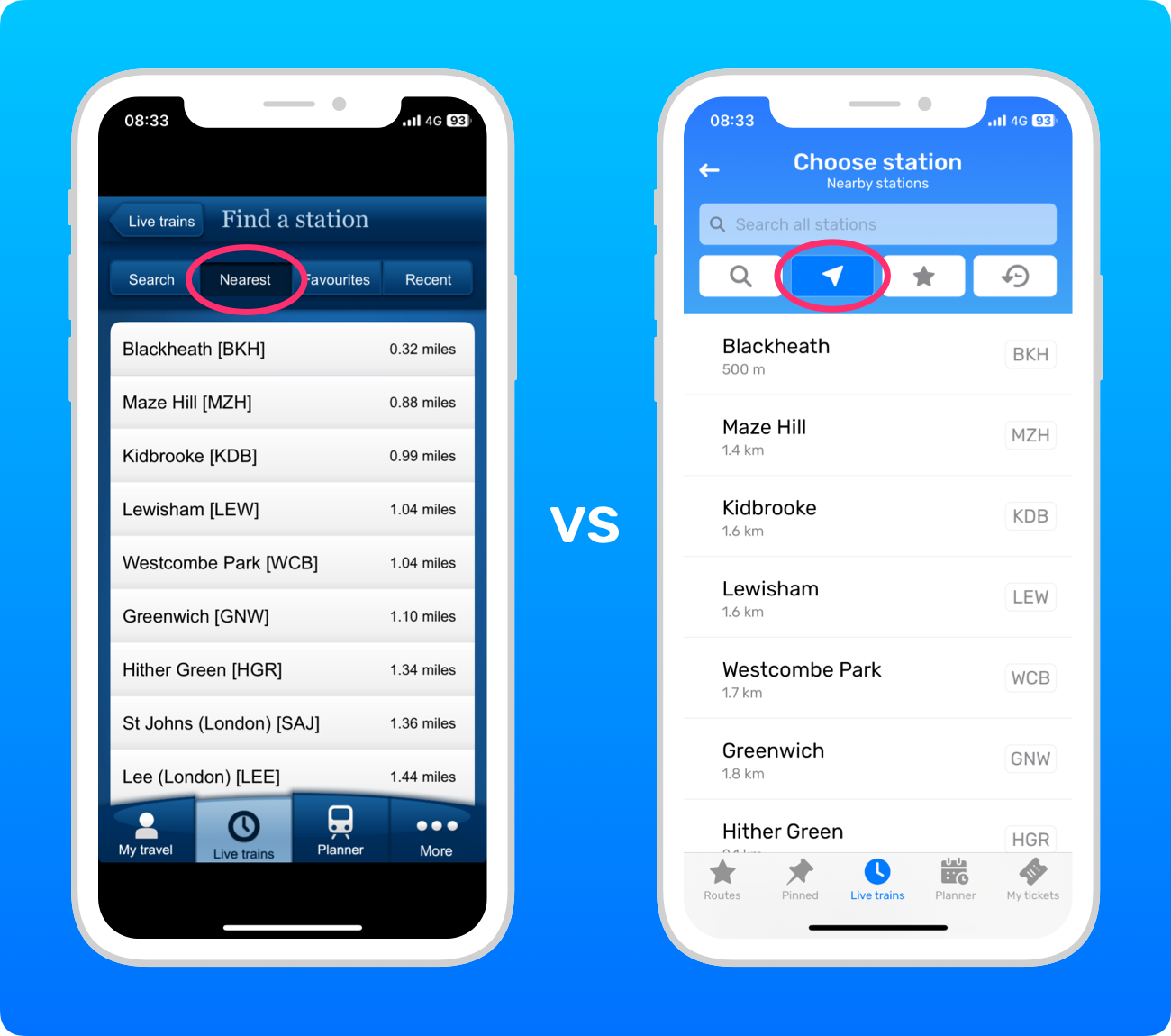
Finding nearby stations
Next, you can find the stations nearest to you.
By default, Railboard shows the distances in metres and kilometres, but you can change them to yards and miles in the settings menu.
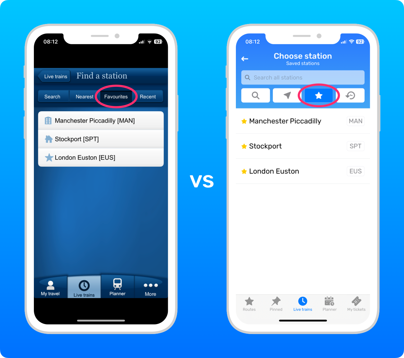
Saved stations
You can save stations in both apps, but in the National Rail app, you can also set a home and a work station.
In Railboard, it’s possible to reorder your saved stations by pressing and holding them, then dragging them to where you want.
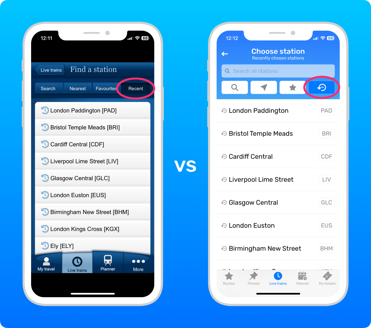
Recently chosen stations
Both apps show a list of your most recently chosen stations.
The only difference is that in Railboard, you can remove a station from the list by dragging from right to left on the station row to reveal a Remove button. Also, in Railboard only, you can clear the entire list with the Clear button at the bottom.
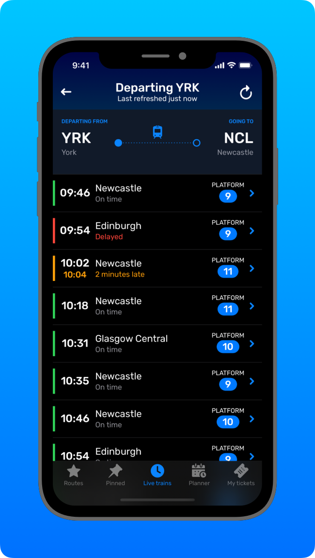
Only in Railboard
As well as not having any ads and being able to buy tickets directly in the app, there is one key feature only available in Railboard... Dark Mode!
A word on open data
Railboard is possible thanks to the commitment of National Rail to make rail industry data open to developers and companies to use. Given the quantity and complexity of all the data National Rail processes, that’s no small undertaking!
National Rail’s open data is why you have such a wide choice of apps and websites for UK train times, each catering to different people and innovating to create the best possible customer experience. It’s also why the information you see across all the different apps, websites, and station departure board screens is consistently the same, no matter where you’re accessing it.
So, a big thank you to National Rail for all their hard work, which makes apps like Railboard possible!
Summary
On the surface, the apps look quite different, but their fundamental layouts are very similar. So if you’re used to the National Rail app, you’ll take to Railboard like a duck to water. Enjoy!
You can download Railboard on the App Store.

